The Maneki Neko (招き猫), the Welcoming Cat is a common Japanese sculpture, often made of ceramic, which is believed to bring good luck to the owner. Each cat has a different meaning according to colour.
Some time ago I found this pretty little multichrome, W7 - Metallic Mars. Lulled away by the beautiful colours I could see in the bottle, I took it to the counter straight away and failed to notice how similar it is to Nubar - Iris Dust. My dislike of having similar colours was not as fast as my 'pretty colours-must have' impulse, which was also assisted by the minimal price of £2. All that is of course to your benefit since I get to do this comparison so you don't have to be fall into the same trap I did. I added Moon Eclipse (former Moon Shadow) in the comparison just for reference.
Open the pictures as a new tab if you want a closer look, all the pictures are taken under natural light. Let the madness begin!
The verdict
Nubar Moon Eclipse is different enough, so I am going to focus on the other two. Consistency-wise Metallic Mars requires 3 layers while Iris Dust 4-5 for full opacity. Both colours have the same type of tiny shimmer particles I spoke about here, however, W7 Metallic Mars'base is a warmer tone than Nubar Iris Dust. When they are showing the pinkish colour, Iris Dust looks a tiny bit cooler than MM and when they are showing the golden colour, Metallic Mars looks bronzier. Frankly, even side by side you can see the differences are minimal, they are close enough to be considered dupes and I don't think you need both.
Αποφάσισα να ανοίξω ένα νέο blog που θα λειτουργεί σαν το ελληνικό παράρτημα του elyssianbeauty και όπου θα παραθέτω κάποιες από τις αναρτήσεις αυτού του blog στα ελληνικά. Ο κυρίως όγκος των αναρτήσεων μου θα εξακολουθήσει να γίνεται εδώ, απλά εκεί θα ανεβάζω θέματα που έχουν οδηγίες και μεγάλα κείμενα, καθώς και όποιες αναρτήσεις μου έχετε ζητήσει στα ελληνικά. Όπως πάντα, μην διστάσετε να μου ζητήσετε κάτι που μπορεί να θέλετε να δείτε εδώ, ακόμα και αν δεν έχω αναρτήσει κάτι σχετικό ακόμα. Το blog είναι ακόμα στις αρχές του και εξελίσσεται! Το link του ελληνικού blog είναι:
I think I making an introduction to my posts the melodic way, so here's some Olga Guillot for your pleasure.
One of the presents I received these days-today actually, but I'm trying to play it cool like I didn't 'aww' when I saw them- was O.P.I.'s Dutch Treat Minis with 4 mini bottles from the Holland Spring 2012 collection. I wasn't planning on getting any to be honest, not because they don't look nice, but because they don't look too different from colours I already have. I still might get Gouda Gouda Two Shoes because I can't resist a goldish aged pink and I have nothing similar. Much as I would love to have all the hues and versions of colours I love, I've decided to be rational; if it's not different enough for a non-colour addict to tell them apart, I won't get it, i.e. no Thanks a WindMillion for me since I have these.
Nail polish is nice, all cosmetics are nice, but (a)they have an expiration date (polish, eyeliners and mascaras 'die' so soon!) and (b)they tend to look dated after a few seasons since textures and colours change dramaticaly over time. They become better and better with much fewer harmful chemicals over time which is good. Enough with the rant though, here we go!
(natural light, shade)
The colours included in the collection are:
I Have a Herring Problem
Pedal faster Suzi!
Kiss Me on My Tulips
Red Lights Ahead...Where?
(sunlight)
I Have a Herring Problem is a beautiful medium dusty blue-green colour with glass flecks in, much like the ones in Orly - Pixie Dust, only Pixie's are silver and varied in size while Herring's are blonde gold and more symmetrical. On the nail there isn't significant difference between the flecks since the yellowish tone is cancelled out a bit by the blue. The flecks are more visible in Herring because the base colour is darker, but the ones in Pixie shine more when light hits them due to the larger flacks.They are most definitely not dupes, but they are in the same family. It would be interesting to see whetherI Have a Herring Problem's sister colour in the collection, I Don't Give a Rotterdam!, is a dupe to Pixie Dust. Both are light blue greys, but I suspect Rotterdam is more blue while Pixie is more grey.
(natural light, shade)
The next ones are a bit blurry to show you how Pixie is shinier and how the difference between blonde gold glass flecks and silver glass flecks is not that big.
(sunlight)
(sunlight)
And a close of the flecks:
O.P.I. - I Have a Herring Problem
Orly - Pixie Dust
UPDATE: I had a chance to check I Don't Give a Rotterdam! myself and it's much much bluer than Pixie Dust and they have different flecks. I still prefer Pixie Dust to be honest. I like the flecks better.
Next is Pedal faster Suzi!, a blue/lavender-toned pink with glass flecks just like Herring's, only silver. I really liked it when I saw swatches of it, but I didn't like it as much when I saw it today and even less on me. The colour is just wrong for me, it make my fingers look yellow and sickly. I have nothing similar to compare it with which is probably why I forgot to take pictures of it on its own. Oh well.. NEXT!
Kiss Me on My Tulips is a pretty bright pink. I don't usually go for pinks as you might have noticed, but this one looks ok. I found a colour that I thought would look similar to is, Essie - Bachelorette Bash. It turns out they are not all that similar and when I read their colour descriptions I had a revelation. KMoMT is a bright pink whilst BB is a 'creamy, juicy fuchsia': so there is a difference between bright pink and fuchsia! I always thought they were the same colour, but as I said, bright pink is really not my thing. Maybe on a hot summer's day I'll indulge in these. That's where they belong in my mind!
Last, but not least, is the colour I though I was going to dislike and never want to wear because it's too bright; Red Lights Ahead...Where?. Actually it took me by surprise how fun and flattering it was on! Even better, it only needed 2 coats for full opacity which was a blessing as the two colours I have that were closest to it were an application nightmate. Ciaté - Mistress was too orange and Ciaté - Snatch more red and jelly-like. RLAW can stand on its own in a salmon-infused red happy universe!
My first attempt at French style stamping. I didn't quite succeed in stamping properly, but somehow I managed to stamp the gold over the green almost perfectly. Learning curve, learning curve..
Base Colour Etude House - GR605 V.V.I.P. (one coat)
...surely it can't be bad! After wearing Mavala - Platinum Marble for a couple of days I had had enough of the pearl shine; shimmer tires me quickly I'm afraid. I filed my nails and since the polish was still in a good shape I decided to give it another chance. Out come my two trustees, Manglaze - Matte is Murder (matte black) and Fuggen Ugly (matte gorgeousness), and taraaa! Beautifully chaotic mani! I loved the feel of it, especially on the second day when it became smoother, but was still matte. It looked amazing! Excuse the dry hands. The weather is so cold at the minute, it's almost impossible to keep them hydrated no matter what I use.
This little gem of a colour from the Winter 2012 Paradox/Paradoxe collection by Mavala caught my attention straight away. It's in that region of colours that you can't quite describe as what you see depends heavily on the light; it can look greyish, lavenderish, brownish, pinkish and all of these together. Of course catching it all with my camera proved to be impossible. It is packed full of a super fine shimmer which makes it look like a pearl. I know a lot of polishes have a 'pearl' finish, but this actually looks like a pearl and (hooray!) it's not at all streaky.
I was a bit disappointed with the pigmentation though. I did 3 coats for these pictures and it still wasn't fully opaque. The good thing is that because of its shimmery finish the nail line is not as visible as it would be with a cream polish. It is a shame though.
When Orly released the Winter 2011-12 'Birds of a Feather' collection I was excited about one polish, Nite Owl, because everybody kept saying that it's like a beige 'Pixie Dust'. 'Pixie dust' is one of the polishes from the Summer 2009 collection 'Once Upon a Time' and it is my favourite light grey polish. It has gorgeous glass flecks in which give it an unusual texture and glow, without being sparkly. The promise of a beige version had me full of anticipation (every time I use this word, in my mind I pronounce it like this, am I the only one?)!
Unfortunately, it wasn't so; Nite Owl doesn't have the asymmetric glass flecks of Pixie Dust, but a rich fine silver shimmer. Don't get me wrong, I still love it! Nite Owl is beautiful on, again it's not sparkly and it doesn't give you the trouble that sparkly polish gives you when you try to remove it. It's just not 'IT'.
Here's some bottle comparisons of the two polishes. The light grey is Pixie Dust and the beige is Nite Owl.
Etude House is a Korean brand and they make a lot of pretty polishes some of which I own. This is the brand's pretty greige (for the unversed amongst you greige = colour midway between grey and beige), otherwise known as Etude House - WH708 creamy grey. I don't have any other greiges to compare it to as I was pretty happy with this one's colour. I have used it again here if you want to see more of it. It was a bit thick when I got it so I added a few drops of nail polish restore and now it's much better. The brush on these polishes was a pleasant surprise as it is flat and easy to work with and doesn't splay. This is two coats without a top coat.
(artificial light)
(artificial light)
(artificial light)
I bought this and many others from this ebay seller and have always received excellent service and many Korean gifts!
It's my birthday!! Yay!! I did something a bit more fun and reminiscent of the carnival!
I've got no idea why the nail on my middle finger looks broke, it's not! Anyway the base colour is Miss Sporty - 455 and I used Stargazer Chrome polishes 236,234 and 237 (more details on these here) with Konad plate m63.
And a song I've been singing all day! Gosh! Don't you just want to hug Big Mama from the moment she appears on stage? She's adorable! No amount of stylists can buy you this much attitude!
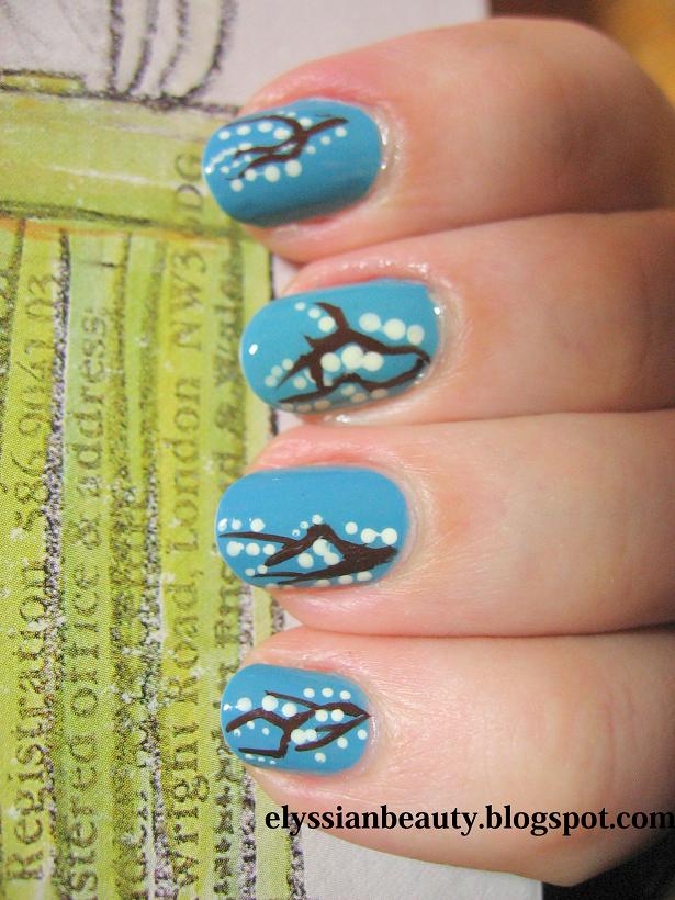
It's been frosty yet sunny these days and the bare tree branches look so nice with frost on them. If only the pavements weren't so slippery and dangerous! I hate having to walk around when there's sleet. I'm not used to it at all and as a result I walk around like an old duck, looking at everyone else who, being more northern than I am, walk normally. How do they do it? Is it a superhuman skill? Ugh...
Btw have you noticed the Google Doodle today? It's for Charles Dickens'200th birthday! Yay! I hope people turn to reading more of his books this year. I was reading earlier in a British newspaper that kids these days lack the attention span for reading his books and if that isn't a sad thing, I don't know what is.
Anyway, I shouldn's stray off on other topics too much or at least that is the purpose of this blog. Back to the mani! It's a blue skies&branches&snow theme! I used China Glaze - Flyin'High as a base, Le Chat Cm 04 Brown Nail Art Polish for the branches, Etude House - WH702 for the snow and Seche Vite Top Coat.
I really like using Stargazer Chrome Polishes for stamping, evident by the fact that I got them all, and I wanted to do this comparison between them for a friend. I hope this explains the ugliness of the mani. I was trying so hard to find designs that would make both chrome colours apparent, yet not cover either of them too much that I didn't even notice how incompatible the designs are till after I did it! I guess I was too caught up in the details to notice the 'big picture'! Haha!
The base colour is Essie - School of Hard Rocks and the Chrome polishes are:
232 - silver (the one I think is best and reach for most of the time)
233 - silvery blue chrome
234 - pinky chrome
235 - violet purple chrome
236 - deeper blue chrome
237 - gold (this is not that great on light and medium colours, but works best on dark as you can see here and here).