I finally got the Drikk Drk-A plate! Yay!! I had wanted that plate since I first saw it because I find the desings much more to my liking than other sets. I will review the plate in dew time, when Drk-B gets here,too. For those of you who are interested in them, it used to be that you had to fill in a google doc to get it straight from the makers in Brazil, but the people at Ninja Polish have made both the Drk-A and the Drk-B plates easily accessible from their website. I ordered from overseas and it only took 6 working days to get here!
I started with a happy little design since it's been so hot these days. It's the first true spring/summer pastel I've worn in a long time, but the cuteness of the design helped the transition.
The base colour is Barry M - Blue Moon (np317). I can't say I liked it very much as a texture I'm afraid. It proved a little difficult to work with, but I guess that's what happens with most pastels. In the bottle it has a blue sheen, but that's not apparent on the nail at any point.
Then I used the beautiful Mavala - Cyclades Blue (167) to get the daisies on and with a dotting tool I added yellow dots here and there.
Dear reader,
I suggest you press play and let your mind wander far far away to a land of myths, folklore and legends, the land that A-England draws inspiration from.
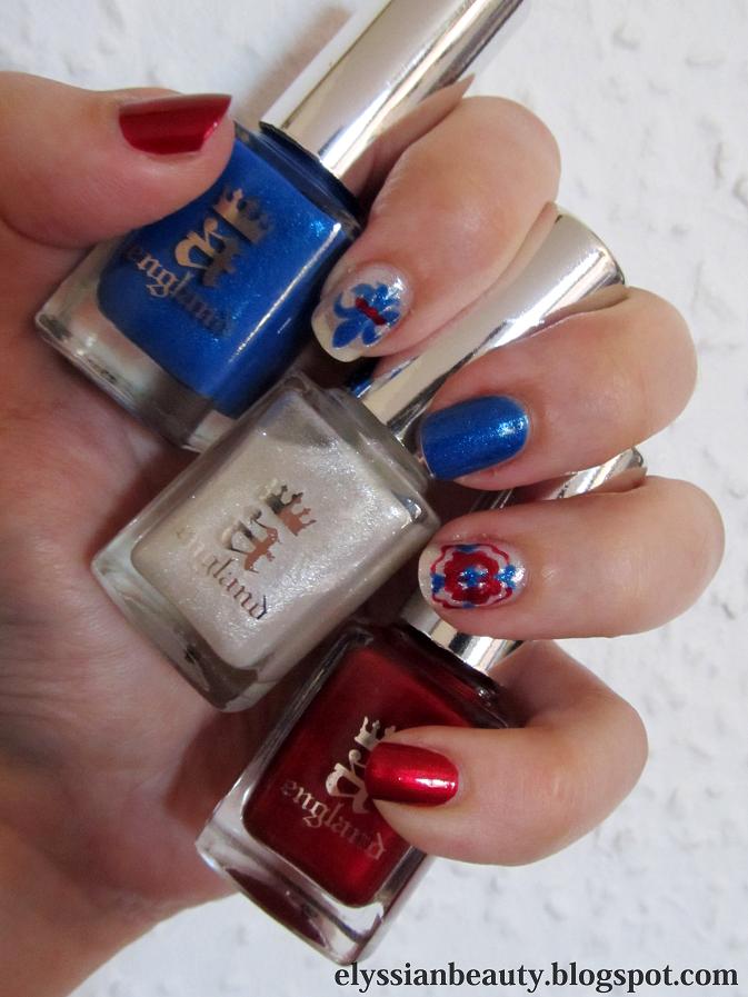
As I mentioned in yesterday's post, I purchased the Jubilicious set of polishes from a-England and today I am going to be reviewing them. There's going to be plenty of pictures, a lot of descriptions and a lot of love in this post.
The Jubilicious set includes Order of the Garter (originally from the Legend collection), Morgan Le Fay and Perceval(originally from the Mythicals collection). Deciding to get these was quite a risk for me as I don't easily like shimmer polish and metallic reds are were a big no-no for me. I have another couple of their polishes which I absolutely adore and I knew I would love Order of the Garter, so I took the plunge and I am so glad I did. I can't stop looking at my nails!
I also overcame another pet peeve of mine by using different base colours for a mani. I like stamping and designs, but accent nails and different coloured nails(e.g. skittle, ombre manicures) usually make me feel very uncomfortable; not so much this time. The designs I chose to do are emblematic of the UK, a fleur-de-lys and a Tudor rose; I know Tudor roses usually have 5 petals which would have been difficult for me to do, but I found a reference for four petalled ones.
As always, I didn't practice before attempting this. Every time I want to do a difficult design that I should practice drawing at least one of twice before attempting it on the nail, a Californian voice in my head says "Duuude, life's too short! It's time to rock'n'roll!" and I just go straight at it.
OoG, MLF, P natural light
All of them have the buttery, applies-itself quality that they've become famous for. What I came to love more about them though is their uniqueness. A lot of thought has gone into them and that is something most apparent when you're dealing with shimmer polishes. Shimmer in a polish changes the colour quite dramatically and the colour and pigmentation of the base can make a shimmer fly or die. I'm happy to say we have some amazing fly-ers here!
Order of the Garter (OoG) was the only one I was certain I would like. Its gorgeous blue colour and subtle blue-green shimmer made me go back again and again to the website trying to decide whether I should get it or not. I'm glad I waited and got this set in the end. OG's base colour, surprisingly, is not a clean-cut blue, but a light greyish blue, a periwinkle that leans more blue than violet. It's not very pigmented and requires 3 thin coats for full coverage, but that is a very good thing in this case as the light base allows the shimmer to show through from all 3 layers thus getting a gloriously complex blue polish! Oh, and it doesn't give you lobster hands in case anyone is worried.
Morgan Le Fay (MLF, only one letter short of 'milf' which the legendary Morgan probably was) is a sheer shimmery topcoat. When used on its own you'd probably need 4 coats at least for a not-so-visible nail line and it will look whitish shilverish with tiny occasional flashes of pink and green. When used over another polish, somehow it looks frosty light blue. To recap: when you want to have fairy like fingertips, use it on its own; when you want Ice Queen fingertips, layer it over a darker polish.
Perceval (P), the one I thought I was not going to like, but became my favourite of the set. As I mentioned before, I don't like metallic reds; they are too Alexis Colby for my taste and I already have a metallic red I regretted buying in the past. Perceval is a horse of a different colour though and most of my pictures failed to capture it accurately; it's not a true red, or a vermilion like the legendary Perceval's armour was supposed to be. It has purple in it and it's one of those polishes that appear darker on the edges, 'lit from within'. Frankly, as soon as I applied it, it reminded me of a crimson rose; it has that amazing rich rose colour that changes with every angle and a soft velvet look. As if that's not enough to love it, in low light settings it has a certain glow about it which makes it even more amazing. I throw my glove at anyone who thinks Perceval is 'just another red'.
If you managed to read through this post, bravo! You must be a knight of NI! Now for the pictures.
Ps-I think I will fall victim to Jubilove after all. If I had it. the fleur-de-lys would have had a Holy Grail line across instead of red, and the rose would have a Holy Grail centre. Merlin would have to wait for his turn. Why didn't I think of that earlier?
Natural Light
Direct sunlight
Direct sunlight with flash
Direct sunlight
Mine! Mine! Mine!
Thumbs up for MLF looking blue over black matte
Base colours are more true to life in this. Perceval I love you!
On the sample you can see how OoG evolves with 1,2 and 3 layers. The '4' is irrelevant.
... the postman brought in this morning!! The A-England Jubilicious set from the Jubilee Delights! I will be reviewing and swatching them later, but the weather is so nice, I couldn't resist snapping a shot!
In case you are wondering they are (left to right): Perceval, Morgan le Fay and Order of the Garter.
You can get either these or the Jubilove set in the special sale price from their website (free worldwide postage!)
PS- Had I bought the Jubilove set, I would have been compeled to have a title as cheesy as "And they called it Jubilove", post this along with it and then you'd be singing that sappy tune in your head all day! mwahaha!
I haven't been using my duochrome/multichrome polishes much lately. They'd be wasted in such overcast weather as you really need natural light to appreciate their colour shifts. I was a bit tired of creme finish polishes though, which is why I decided to use a polish with a strong shift.Nubar - Wildlifeis the polish I chose and it did not disappoint-quite the contrary. I decided to go all out and stamp it with Stargazer 234 (pink chrome) using a design from Konad plate m83.
This design somehow makes me think it belongs on the walls of a 70s hotel in Las Vegas where they would play Tom Jones-type songs.
Take care!
xx
Edit: I had to add a video in the end. The post felt empty without it!
Another excellent product that my friends sent me is the lip care by Korres. I know many people love the Korres lip butters, but dipping my hands in in order to apply just never appealed to me. I prefer these that come in a lipstick tube.
The colour I have is 'Grape', the brown shade. It's very sheer, not too shiny and pleasantly moisturising. It had a very subtle, natural grape-like perfume that you can't smell after the application. I definitely want to try more colours!
I am so tired of this November weather. I really needed something sunny and playful and since I can't make a quick escape to somewhere warmer and sunnier, I settled for a sunny colour on my nails with a bit of stamping to make it more interesting.
The base colour is Bourjois 39 Jaune Trendy, a lovely warm mustardy yellow that is rather goopy and I think I should add a few drops of thinner before I use it next time.
Then I put nail guides on to limit the design on the top third of the nail only and stamped it with Konad White stamping polish using Bundle Monster plate BM21. I finished it of with dots of greens and blues. From thumb to pinky they are: OPI - Jade is the New Black, China Glaze - For Audrey, China Glaze - Flyin'High, W7- Stellar, China Glaze - Aqua Baby.
Tonight dear readers put on your rose-tinted glasses as we will be travelling to late 19th-early 20th century Austria. Let's start with some appropriate music: Mahler's 5th Symphony conducted by von Karajan; could I have more Austrians in one post? Of course!
Gustav Klimt was a very unique artist, as well as a controversial personality. He had his artistic vision and wasn't afraid to pursue it, even if it meant making (a lot of) enemies on the way and fathering plenty of children. His most famous paintings have been and still are very popular, though they are not referenced as 'pornographic' any more (woohoo! Civilization is moving forwards despite honest efforts to not do so!). Klimt's paintings are so full of colours, textures, patterns that you could spend hours looking at each one and still not manage to see everything in it. They feel alive when you look at them, they feel like art should feel: mesmerizing. It isn't any wonder at all that his portrait of Adele Bloch-Bauer is the most expensive painting ever sold openly.
The Kiss
For this manicure idea I wanted to bring out another side of him that is not as well known as his popular paintings; his postcards. He used to write many postcards -there's over 400 if I'm not mistaken- to his life companion Emilie Flöge which he would decorate himself. Many years ago I saw one of those cards in a book about him, the image stayed with me and I was lucky enough to find a digital copy of it. I have a sincere love for the heart symbol so I'm guessing I don't need to explain exactly why I like this card. For my third attempt with brushes and acrylics, I had a go at this:
I did get a better brush this time, but I need to find an even thinner one. I know I should practice these more elaborate designs, but I really can't bring myself to do it. I am so busy with everyday life I just want to relax when I do these and -heck!- you only live once.
Artificial light
Artificial light
Natural light (cloudy weather)
What I definitely need to practice more is taking better pictures with my new camera. I didn't manage to take great pictures this time either and I can't pinpoint the problem in the settings I use. It's also adding a yellow tinge to my hands which is so not flattering, especially on top of my inability to capture the perfect hand-pose these days. I will get there, I'm stubborn. And I have probably scared you off with my rant. Hahaha! I hope you like the mani anyway!
Tschüß ♡
Oh! Joy! I was immediately drawn to this month's In Style when I saw it from a distance cause it features one of my major girlcrushes, Eva Green, and then I noticed that there was also a free nails inc. polish! I must say, those are not really my kind of colours, I picked the purple one as I liked it the most and I don't have one that light, but the other two I wasn't keen on.
The colours are:
InStyle Bluebelle, a light periwinkle purple (the one I got)
Here are some of the pictures from the magazine, just cause she's gorgeous. By the way, her make up is by Lisa Eldridge! Click here to watch a behind the scenes video.
How do I begin this post without getting distracted by Kang Dong Won and the Duelist's beautiful soundtrack for another hour? By sharing a song with you my dear reader!
'The Duelist' is a fictional period Korean film with stunning visuals, a beautiful, sad love story and two of my favourite Korean actors, Kang Dong Won and Ha Ji Won. If you like "Crouching Tiger, Hidden Dragon" and "House of the Flying Daggers", then definitely watch this; the budget may not be as enormous as it was for those two films, but it is truly wonderfully shot, the script is good and the actors great.
When I first started nail stamping last year, one of the patterns I wanted to recreate was from the protagonist's costume. Sad Eyes wore mostly black textured clothes and this idea of black on black simply stuck with me as I am fascinated by black. I tried many times to create something similar back then, but the results were not good enough.
He's so gorgeous!
Beautiful fabrics and a beautiful man. Ah! My heart!
Enough with the Kang Dong Won spam, back on topic. A few days ago Nathalie (jellynat) had this post up which reminded me of my quest for the black on black mani I wanted to do. Then this scandalously pretty picture of JaeJoong appeared yesterday from the upcoming 'Time Slip Dr.Jin' Korean drama who reminded me of 'Sad Eyes'.
He is a real person, not a CG character.
The final blow was delivered by my friend Orion who reminded me of all the above, so I did it. This time I picked a pattern that would allow for the different textures to be more apparent, as my previous choice (the multiple squares from the konad m63 plate) was too dense and it ended up looking muddled instead of textured. My only complaint this time is that I should have used a thicker black glossy polish to stamp. The one I usually stamp with was ruined when I decided to 'experiment' with it a few weeks ago. The search for the perfect black on black mani continues, though I think that first I'll have to do a red on black like JaeJoong's costume.
basecoat: SpaRitual - Body
Stamping polish: Bourjois - 39 Noir de Chine
stamping plate: Konad m64
PS- Should I have a 'gorgeous Korean men with swords' tag now? haha...
Today I received the most amazing packet from my wonderful friends full of presents that made my heart flutter like a five-year old's on Christmas day. It took me about an hour and a half to go through them all. Am I the only one that prefers a million little things instead of a big present?! The Yamashita Tomohisa fan in the picture below was in today's parcel and deserves a spot here. Yamapi(山下智久)is a Japanese pop star/actor and, thought I am not a crazy/omgodIhavetowatcheverydramaheisin fan I find his diary entries very amusing as it's like reading a kid's diary; they are almost always about him being hungry, what he ate, how he worked out and -of course- the weather report. He makes me laugh. My friends know me so well that some of the things they sent me are cosmetics and they will be featured here!
My mani with a Yamapi fan that was also in the packet.
My friends are crazy and funny.
The first of these things is a Korres nail polish! I didn't even know that Korreshad a nail polish line till a friend told me about them and then she sent me this one, isn't she great? I've not found them in their on-line shop so I'm not sure where you'd get them from at the minute. Korres polishes go beyond 3-free; they are 7-free as they have no silicones, acetone, phthalate, formaldehyde, camphor, toluene and xylene. Now if only they were a certified cruelty-free company, too, that would make them fantastic! I don't know why they haven't made a move towards that, but it's a shame as they are great in all other respects.
The colour I received is Vert Amande (92), a beautiful minty green cream. I've not checked out all the colours, but I am sure that this would be the first colour I would want to try. Even though it's a cream it has depth; it feels a bit like a jelly, but still manages to be opaque in two coats. I really love it! It's also not too pastel or stark and it doesn't give me lobster hands. The application was very smooth as you can see from the pictures. The brush is a normal round brush, not flat like I am used to and it'd be nice to see this improve in future versions. Normally I make a good mess of my cuticles when I am handling a round brush, but look at the pictures: no mess even though I've not done a clean-up! It applies like a dream, smooth and perfect with no issues of bubbling. I don't know how long it would take for it to dry as I applied a fast-dry top coat.
One coat (artificial light) Check out how smooth it goes on!
Two coats (natural light-cloudy)
Of course, I had to do a bit of stamping. I used SpaRitual's gorgeous dark bronze colour Running with wolves and Bundle Monster plate BM214 (from the second collection of plates).
Thank you my dear friends! You bring so much light in my life!
PS- Excuse the slightly blurry pictures. My camera broke down, I have a new one and I'm still getting the hang of it.